An Average Day
Written on May 5th, 2020 by Kat (a compilation of student work)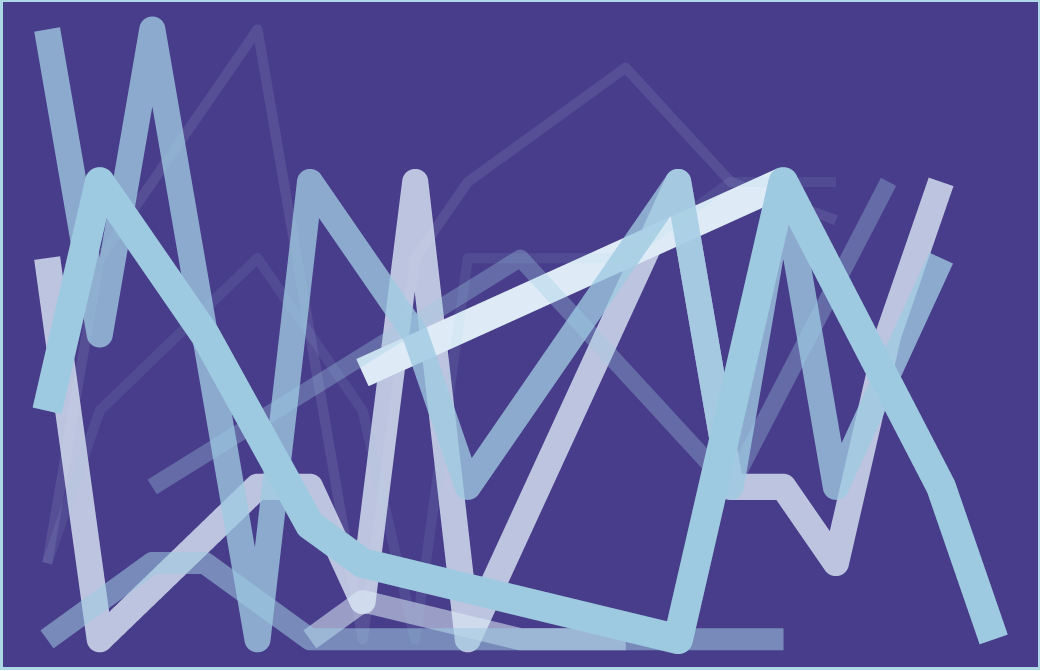
More Data Art!
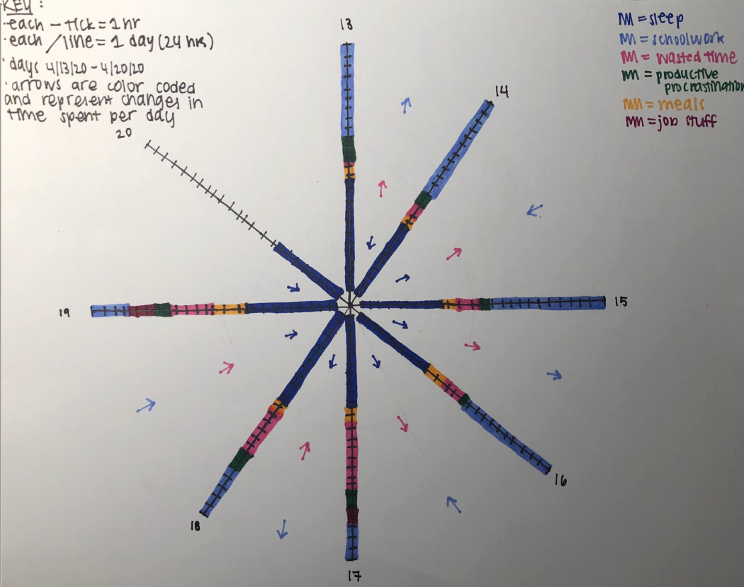
Courtney Resch was inspired by the art of Giorgia Lupi and Stefanie Posavec in their Dear Data project. Courtney visualized how her time during quarantine was allocated between schoolwork, meals, productive procrastination, wasted time, and sleep in a hand-drawn figure:
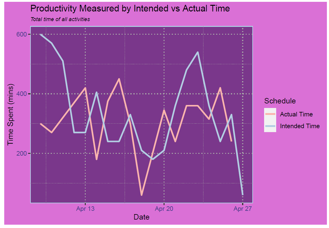
Another student, Grace, also created some awesome data art. She used R:
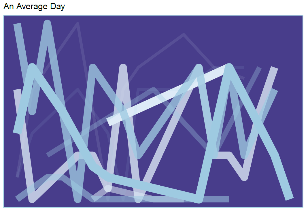
Can you guess what the x and y axes represent? What about the different line colors and sizes?
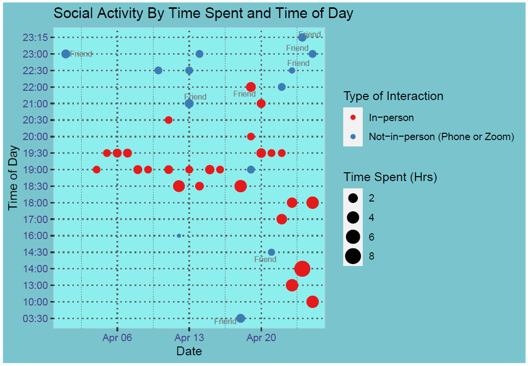
Grace also created colorful plots to visualize her productivity and, separately, her social activity interactions (in-person or virtual):
How do I spend my SCREEN TIME?
Instead of using Google calendar to track their time, another student tracked their screen time via their iPhone’s app tracking feature: “I decided to look at the categories that my phone produced by itself: Social Networking (Messages, Instagram, Snapchat, FaceTime), Creativity (TikTok, Photos, Camera), Entertainment (Spotify, Amazon Music, YouTube, GuitarTabs), Productivity (Gmail, Calculator), Games, Other (Safari mostly).”
“I first looked at what apps/categories dominated my screentime as a whole. Not surprisingly, social networking was the clear winner. This means I spent a LOT of time messaging people or on some form of social media app. Instagram was probably the biggest time-sucker from this category. The only other two categories to occupy significant amounts of time were creativity and entertainment. Creativity honestly just meant TikTok, an app that is pretty similar to Instagram and doesn’t actually require me to be creative. Suprisingly, I only used my phone for “productivity” for about 46 min the entire week. The overwhelming majority of things I used my phone for was almost completely pointless. I have gone on social media fasts before, but I think this study has shown me that if there ever was a time that I needed a fast from my phone, it’s now.”
I think many of us can relate to that feeling! How did the student’s screen time use change as the week progressed?
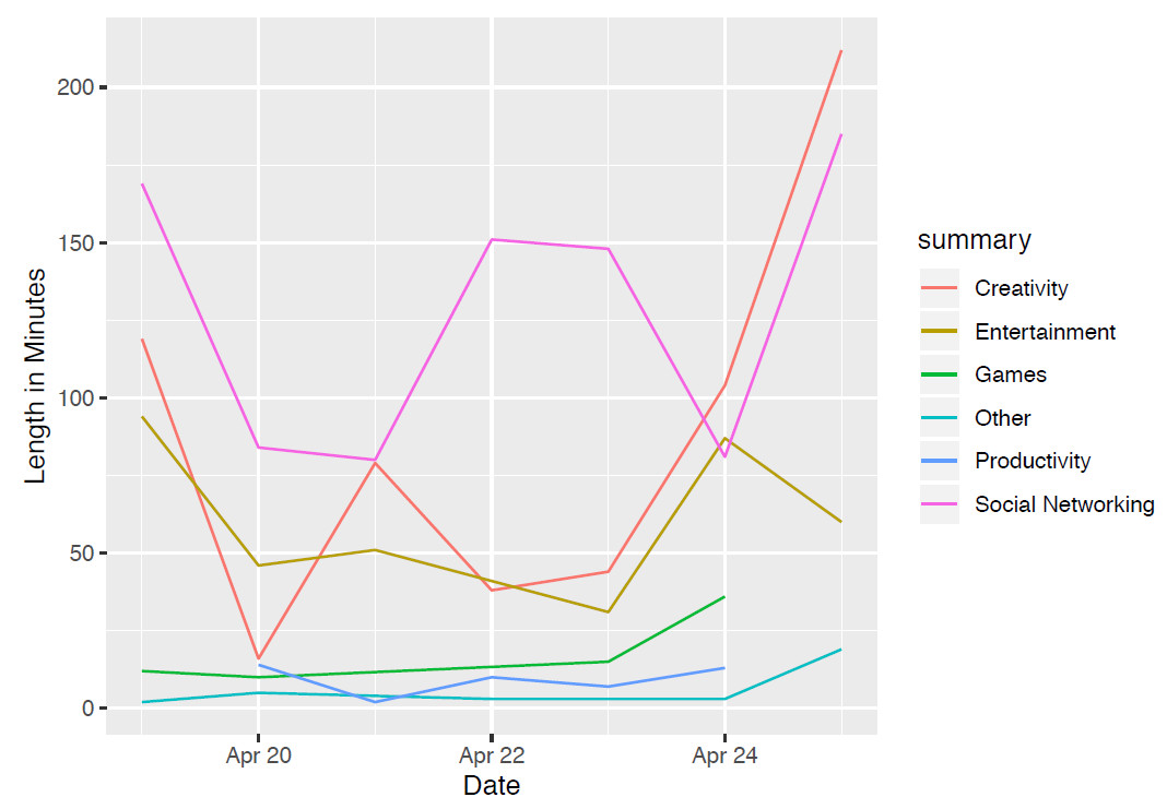
The student concluded, “The first thing I [noticed] was that on the weekend, at the beginning and end of the graph, productivity is literally non-existent. I suppose this is to be expected, but it was still surprising to see. This is also coupled with spikes in creativity and social networking. So, I was even less productive on the weekends than the already low standard I had set during the week.”
Family participation!
Ainsley’s mom joined in on the project. Ainsley noted, “Going into this project, I was looking to compare how I spend my awake time in comparison to both how I intended to spend it as well as to how my mom spends her awake time. In comparing my actual schedule to my intended schedule, I wanted to see how well I know myself in terms of productivity and [allocation] of my time. I wanted to look at my mom’s schedule to see how she spends her day. I already knew going into this that she would be much more productive than me, but I was curious as to how much more productive she was.”
How’d it go?
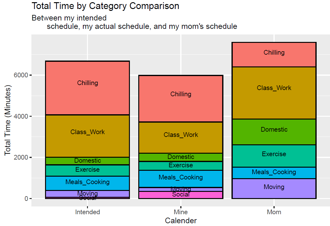
“From [the figure], you can see that my mom has a more evenly balanced schedule than mine and spends more time working and being productive. My mom and I both made sure to start recording our time once we got up through when we went into bed. This allows us to also see that my mom spends more time awake than I do since she tends to start her days much earlier than I do to walk the dogs. This of course also increases the amount of time she has to be productive.”
”. . . This project was actually a lot of fun although I did not learn anything remarkably new about both myself and my mother. As mentioned above, we both already knew that she was more productive and better at distributing her time more evenly than I was. Yet it was interesting to be able to actually have data to support those ideas.”
I must be dreaming . . .
A number of students analyzed their sleep patterns.
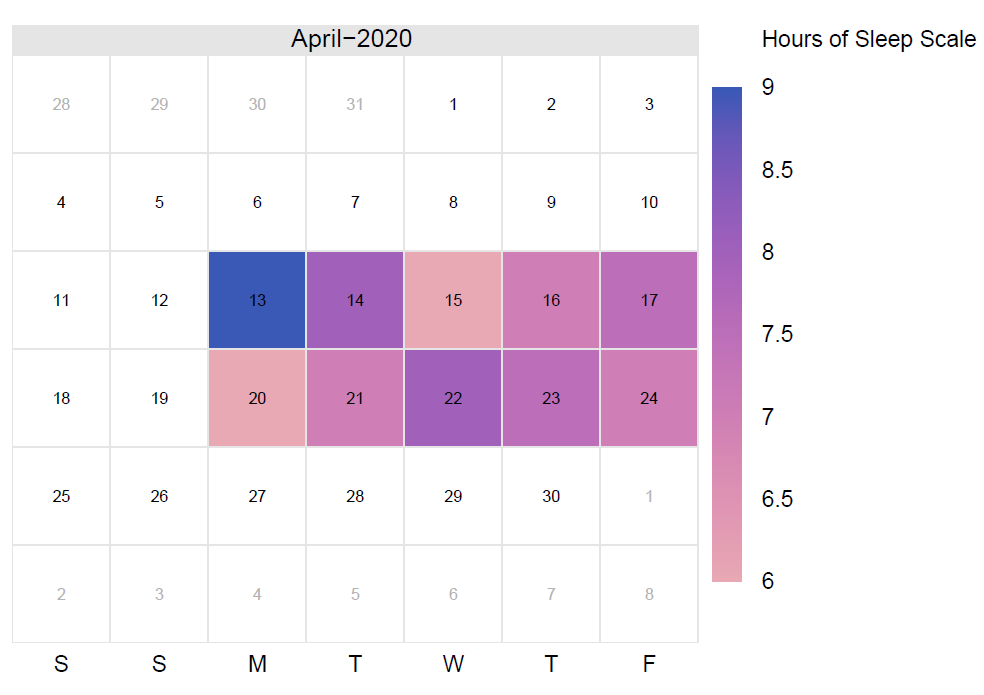
Bobby Innes-Gold created a calendar plot to visualize how much sleep he was getting each night:
He also created a scatterplot to visualize how his sleep and productivity might be associated. He measured productivity as a function of intended time and actual time spent on an activity.
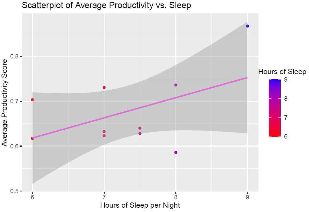
He noted, “While nothing can be concluded on 10 data points from 10 days, there actually does seem to be an upward trend in the plot. This would indicate that the more sleep I got in a night, the more ‘productive’ I would be the next day.”
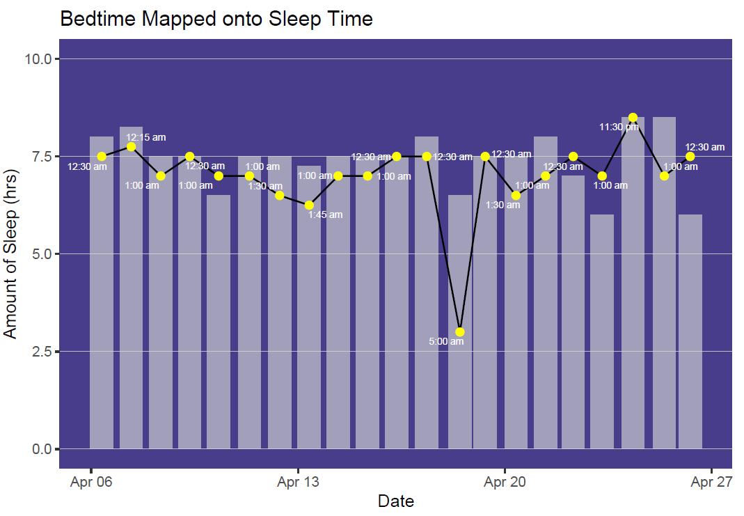
Some students focused on what time they went to sleep. In this figure, Grace assesses whether the time she went to bed was related to how much sleep she got:
In this figure, another student compares what time they planned to go to bed versus when they actually went to bed:
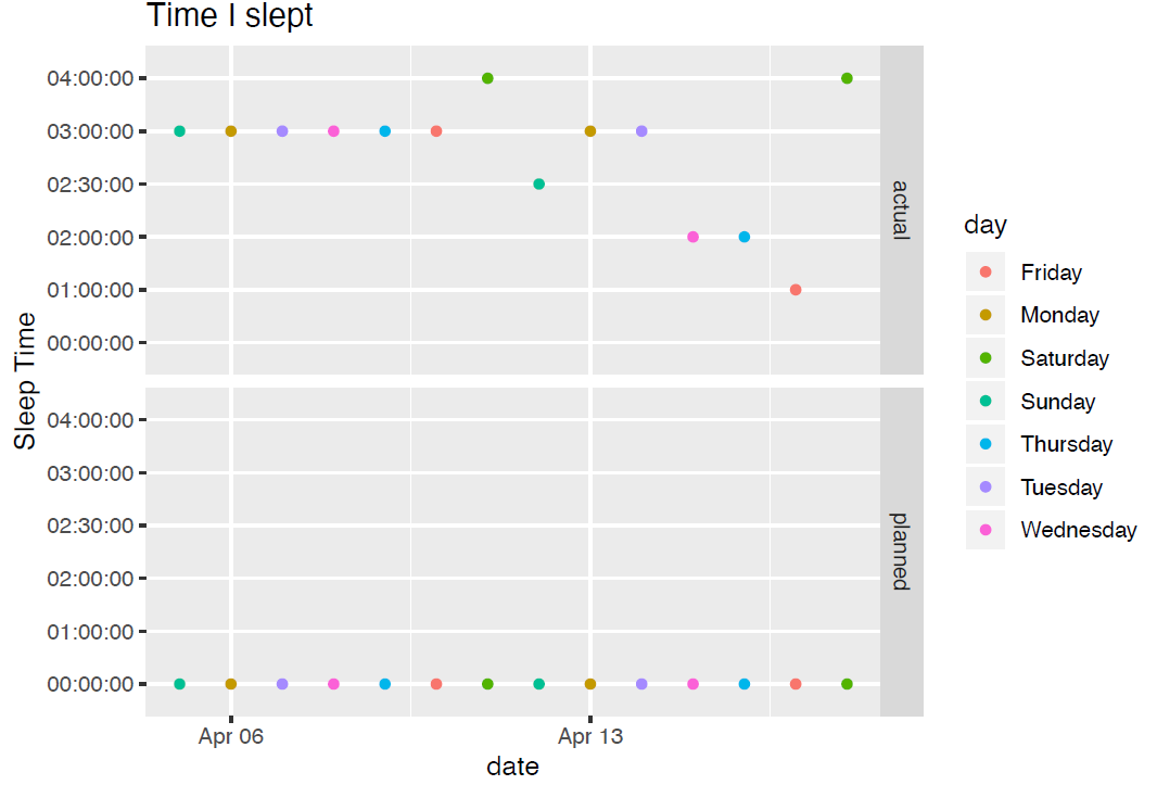
Interestingly, the second student found no relationship between the total hours slept and either the day of the week or the time they went to bed. Despite going to bed later than planned, the student did manage to average over 8 hours of sleep per night across the two weeks.
Sleep experts suggest most adults need between 7 and 9 hours of sleep each night. 8 is commonly considered the magic number. That’s 1/3 of each day, so if we’re getting sufficient sleep, we’d expect it to take up a big chunk of our time pie. Kudos to these students who were able to prioritize sleep:

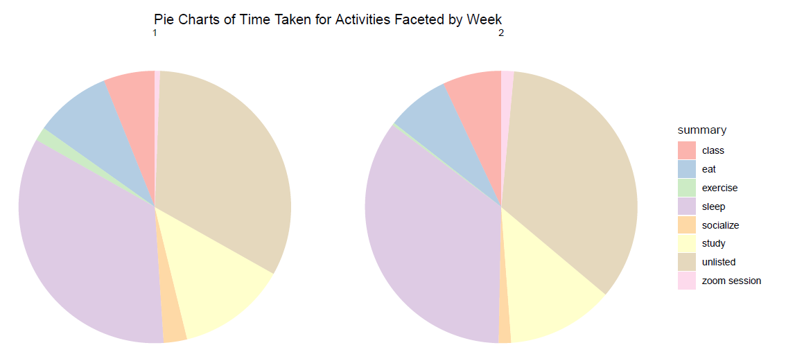
Note that “Zoom sessions” took up a very small slice of those pies – but it’s something that probably wouldn’t have made it into the pie at all in a usual semester.